Being able to do more is no longer enough, we want to do more and we want to do it faster than ever.
The challenge is finding a balance between how much we can do and how quickly we can do it.
Because of that, we must explore new patterns without forgetting the lessons we learned from the early days of Human-Computer Interaction.
In this post we’ll revisit Gesture-based Radial Menus, their advantages, guidelines, and look at a few existing and possible examples.
Problem
We want more, we want it faster. Apps grow in complexity over time, even well-designed ones that do just one thing are likely to add a few more options over time.
Customers however, don’t care about the app, they simply want to book a cab, share a picture, send a text as easily as possible and go onto their lives.
One of the answers to this problem has been called ‘The Great Unbundling’, where a set of features from a larger app is encapsulated into a smaller, more focused app. Facebook Messenger is one example of this, it does one thing and does it extremely well.
But even within these focused apps, certain actions are so frequently used that we notice every tiny bit of friction.
Solution

This is where linear gesture menus come in. When paired with certain layouts, they allow for quick visual search and selection times.
Radial menu layouts are most common, and when restricted to a single level they’re also most efficient. While not as efficient, linear gestures can also be applied to vertical or horizontal menu layouts.
Efficiency is mostly impacted by content predictability and layout.
If content is static and items large and equidistant from the initial contact point (i.e. Radial layout), then visual search isn’t needed and we can simply use gesture muscle memory resulting in very quick selection times.
By comparison, dynamic content is unpredictable requiring visual search, and non-radial layouts force us to determine selection based on distance instead of direction.
Using direction is less error-prone, and more comfortable on larger devices as shorter finger movements are less likely to leave the comfort area of the original touch.
Advantages
- Speed
- Comfort
- Subjective Visual Appeal
For the reasons described above, linear gesture menus can increase selection speed, while maintaining comfort and the radial layout may introduce some novelty.
Disadvantages
- Scalability
- Information Density
- Items may be obscured
- Affordance
Every pattern has its disadvantages, in order to ensure visual search and selection speed, linear gesture items can only contain a small number of items. This is because smaller items are harder to select, and large items use up more of the limited screen estate.
The required item size in combination with the most efficient layout — Radial — doesn’t leave much space to display extra information such as text labels.
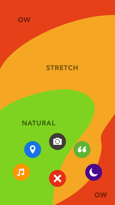
Items may also be obscured by fingers, one solution is limiting items to an area that’s more likely to be visible. This can be tricky, the best is to avoid assumptions about handedness, and either start the gesture from the center of a screen edge (i.e. Path) or use layout intelligently (i.e. Mass Effect).
Guidelines
- Use few, static items
- Prefer a radial layout for efficiency
- Items should be large and with enough spacing
- Best as a shortcut for frequent items/actions
- Include a fallback or hint on tap
- Tap-based radial menu fallback to bring tap and gesture closer
- Provide feedback for gesture start, progression and completion
- Use large, spaced and distinguishable items for comfort
- Avoid obscuring items through placement and layout
Examples
Messages

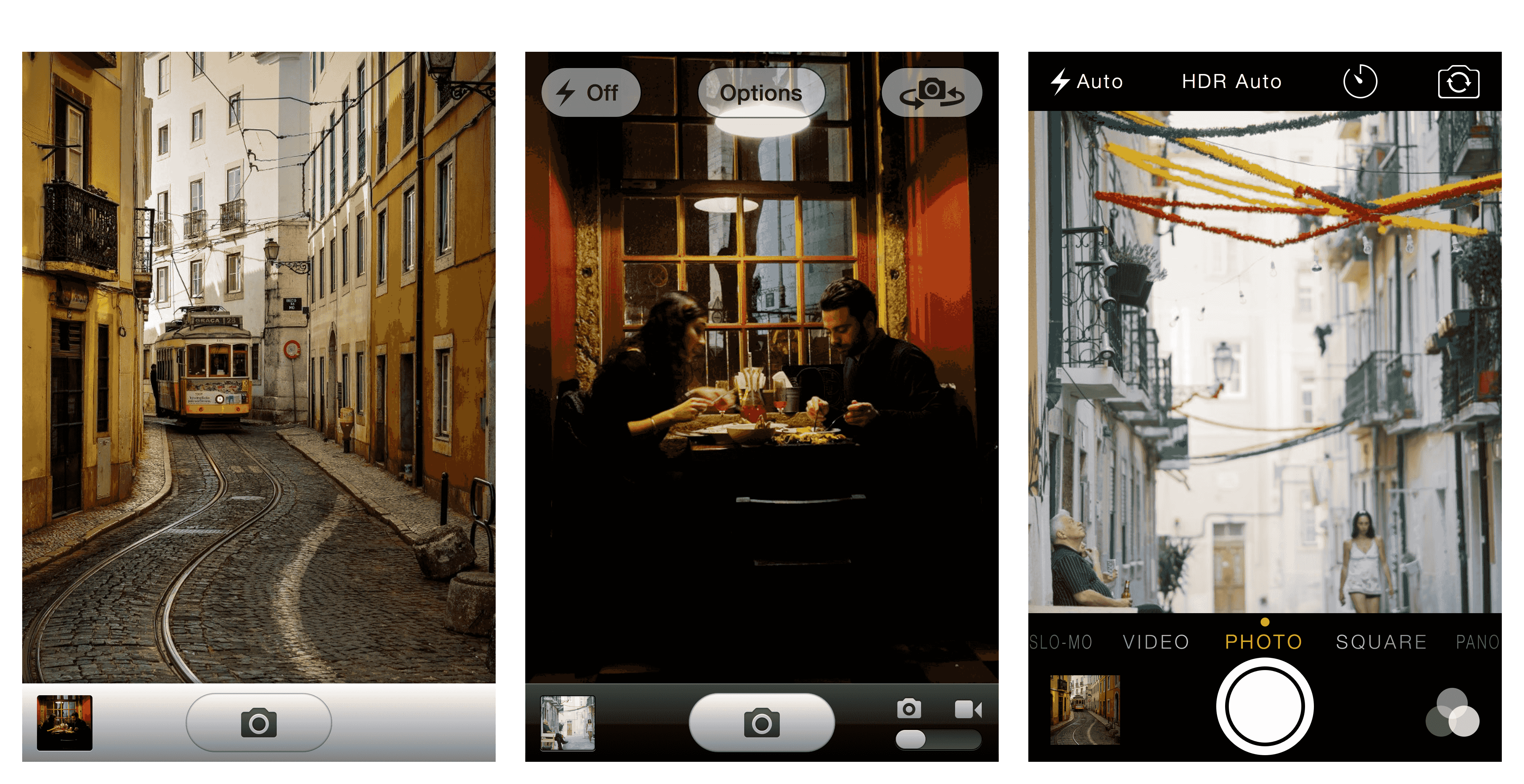
Messages on iOS 8 implements a gesture-based radial menu for quickly sending media.
It has few, static items displayed on a radial layout. This implementation has the following issues:
- Affordances: insufficient hints
- Performance: low
- Layout: items likely to be obscured
- Feedback: insufficient gesture feedback

Voice input does indeed provide a hint, but tapping the camera icon provides no clue about linear gesture support. While this feature is non-essential and aimed at advanced customers, tap and gesture input could still share the same UI. This would make it easier to provide an animated cue perhaps, and would help transition novice into experts customers.
Performance is (intentionally?) low, gestures can only be performed after pressing either button for 1 second and . This might be an error-prevention mechanism, but perhaps the same could be achieved by analyzing gesture length and speed.
Mass Effect
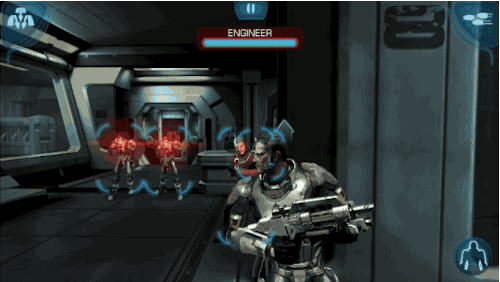
Mass Effect is overall a great example of non-casual mobile game design, it has all the key elements from the original game — story, sound, environment — and its controls are perfectly adapted to touch.
Linear gestures are used for quick Weapon and Power selection, implemented as radial menus positioned on the top corners.
This implementation has few, static items displayed on a radial layout. Items are large for easy selection, and placed far from the initial touch point to ensure they’re not obscured by the finger.
As the finger moves into one of the items, the initial touch point — which is no longer hidden by the finger — updates to display the item that will be selected upon finger release.
Upon release, selection is confirmed and the gesture shape slowly fades away, reassuring which gesture was recognized. Being a radial menu, the trail is easily distinguished via its direction.
Fluid-Touch Floating Action Button
This “Fluid-Touch Floating Action Button” prototype uses a vertical linear gesture menu with an optional(?) horizontal gesture for confirmation.
Unfortunately it has several issues:
- Layout: hard do scale and remain comfortable beyond 3 items
- Interaction: relies on vertical accuracy and horizontal dexterity
- Contents: variable thus unpredictable, preventing muscle memory
On a positive note, it supports non-gesture selection and still manages to add some visual appeal.
Wrap Up
When implemented correctly, linear gestures provide very quick access to a small number of actions and help introduce some novelty.
Don’t compromise on muscle memory, if you do so, this pattern becomes nothing more than a gimmick. A novel but hard to discover menu.
Number of taps isn’t a performance metric, cognitive load is. Tapping or swiping can be equally bad if their outcome is unpredictable.
Hope you enjoyed this article, feel free to share it and check out my work. Contact me if you’re interested in working together or have any constructive feedback you’d like to share.
Credits
- Thumb Zone templates by Scott Hurf
- Streets of Alfama by Krzysztof Kusy
- Late meal by João Almeida
- Having a break by João Almeida
- Fluid-Touch Floating Action Button Prototype by Ralph Thomas
Research
Supporting menu design with radial layouts.
- “we compare two main characteristics of radial and linear layouts: a) the time is takes to find an item(i.e. visual search time), b) the time it takes to navigate to an item (i.e. pointing time). We use objective and subjective measures, two menu sizes, three menu levels, one linear and three radial layout variations.”
- “providing easy and fast access to these [menu items] is a real challenge”
- “the issue is especially important for professionals who utilize menus extensively, invoking hundreds of commands during their normal work session (e.g. 3d modelers or video editors)”
- “a set of cascading menus is one of the most widely used designs to access hierarchies of commands [multi-level hierarchies present higher error rates due to item size/interface, is time-consuming]”
- “One approach to decreasing the navigation requirements in menus is to use alternative layouts (i.e. different spacial placement of the menu items). Radial layout is one example that both shortens the distances between the menu items and increases their size.”
- “Novices unfamiliar with the menu content and command locations have to search for commands visually. In this case, the overall selection time depends on visual search and pointing times. However, users quickly develop and rely on spatial knowledge for menu item locations (i.e. they become expert users) if the layout of the menu is stable. Consequently, visual search time decreases as users become experts and the overall selection time then depends mainly on decision and pointing times.”
Notes on the History of Radial menus, Pie menus and Marking menus
- “In terms of the use of gestures, a key observation reported in Callahan et. al. [2] was that items could be selected very quickly because selection could be performed without looking at the menu since direction of movement distinguishes an item.”
- “Further work by Hopkins [4, 5] reported that as an artifact of operating system input event buffering, a user could make the mouse movement needed to select from a hierarchic pie menu without having to wait for the system to display each menu.”
- “Hopkins believed that this resulted in faster menu selection times (especially when the display of menus is slow). Later work by Hopkins formalized this “mouse ahead” concept by explicitly suppressing the display of menus while dragging.”
- “Kurtenbach [6] further refined the “mouse ahead” artifact by introducing the concept that cursor movement during selection generates a path that identifies a particular menu item. Furthermore, if the cursor left an ink trail when generating one of these paths, a mark that identifies a menu item is created.”
- “Kurtenbach then introduced the notion of scale independence: a mark can be draw at any size and only the shape of the mark, not its size, identifies the menu- item being selected. Kurtenbach believed that scale independence was a critical property in allowing very fast selection. In earlier pie menu systems, the user, even when selecting using “mouse ahead” still had to be aware of the size of the menus and carefully control their movement. Kurtenbach believed that with this constraint removed, menu selection could be performed even faster and this effect would even be more pronounced in hierarchic menus.”
Touch Means a Renaissance for Radial Menus
- “gestures get embedded in muscle memory, which is faster to access than visual memory.”
Apple experimenting with “radial” menu design
- “It looks visually interesting, but they are not spatially efficient. The use of screen real estate (particularly on smaller screens) is a trade off between readability and aesthetics. This seems more aesthetic than readable from a small screen perspective.”
Are Radial Menus The Future Of Office?
- “A mouse is optimal for precise targeting, and touch is great for broad strokes such as scrolling and zooming. In some postures, such as standing, touch is the preferred input, while the efficiency of typing at a desk is hard to beat. Each posture and input characteristic is great for some jobs and not as good for others. We wanted to make sure Office apps felt intuitive, natural and comfortable as across different postures and different kinds of input.”