
A map showing the countries where the 200+ restaurants where AmRest rolled this Kiosk to are located: Czech Republic, Poland, and Hungary.
In Poland, AmRest runs the KFC franchise with an expanding network of 280 restaurants. This franchise operator is active in 10 other countries, and holds the franchise rights to Starbucks, Burger King, Pizza Hut, KFC, and more.
This case study is about the KFC Poland in-store Kiosk. I’ve previously written how I helped bring Order & Pickup to their mobile app now being used in 3 countries, serving over 300 restaurants.
Goals
- Reduce queues
- Serve a broader customer cohort
- Best-in-class customer experience
Following the success of our Order & Pickup work, I helped KFC Poland increase orders per restaurant, without increasing operational costs, by creating an in-store Kiosk.
Part of the solution involved satisfying the needs of customer who prefer to order on their own time, avoid queuing, or don’t speak the local language.
Role
Responsible for end-to-end design of the Kiosk app, as well as liaising with client and development supplier. My role was of Lead Designer, there were two other designers joining in for design reviews, and providing illustrations. Designers, client and suppliers were on timezones ranging from +1 and -6h hours.
End-to-end design is defined here as: research (formal/guerrilla/market), design sprints/workshops, interactions, visuals, content, prototypes, strategy/prioritisation, documentation, and developer guidance.
Process
Preliminary Research
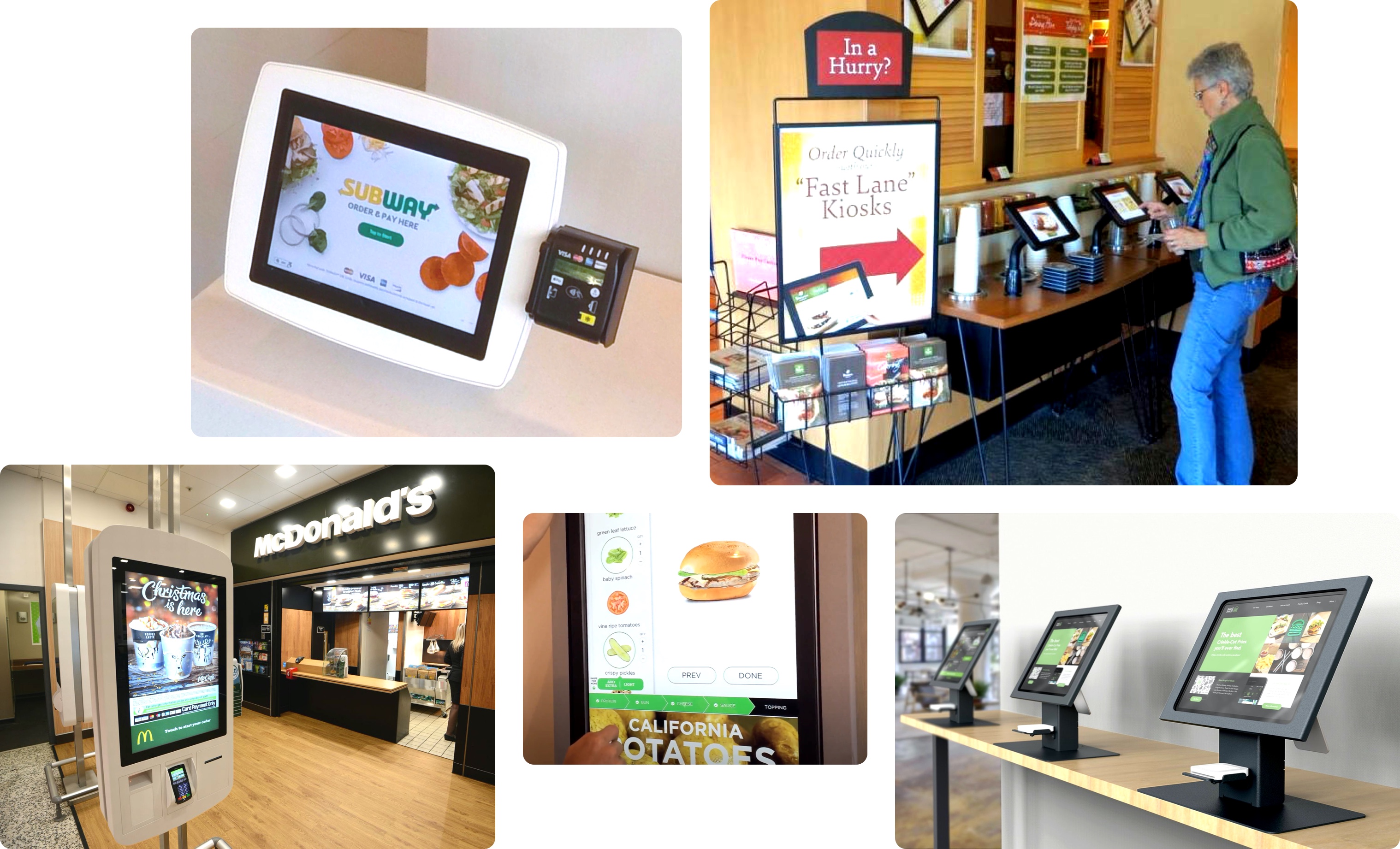
Self-service kiosks from companies including Panera, McDonalds, Subway.
Prior to the kickoff workshop I reviewed what we had learned from working on the KFC Mobile app: young price-sensitive Android users, with a significant portion who feel like in-person ordering and queues add pressure when placing an order.
I researched competitor Kiosks through desk research, in-restaurant observations and interviews (e.g. McDonalds, Panera). I also reviewed KFC’s uniform, restaurant, and menu board identity to ensure the Kiosk interface blended in.
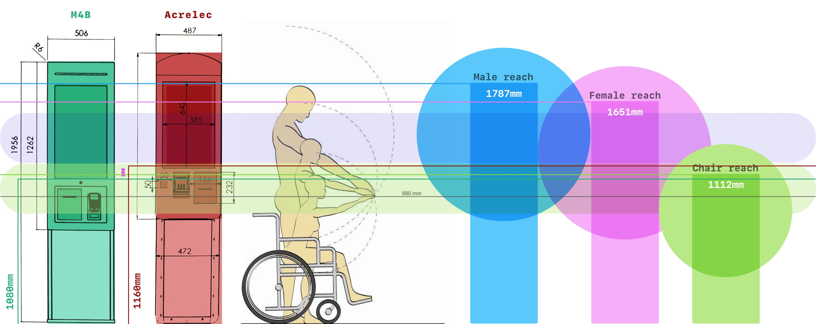
Ergonomics study, overlaying hardware dimensions and average reach for Polish males, females, and wheelchair users.
Finally, I reviewed the hardware going through the tender process to understand ergonomics, capabilities and limitations. This would be used to inform the hierarchy of the user interface, and try to build a case to find hardware that could be made accessible for wheelchair users (unsuccessfully).
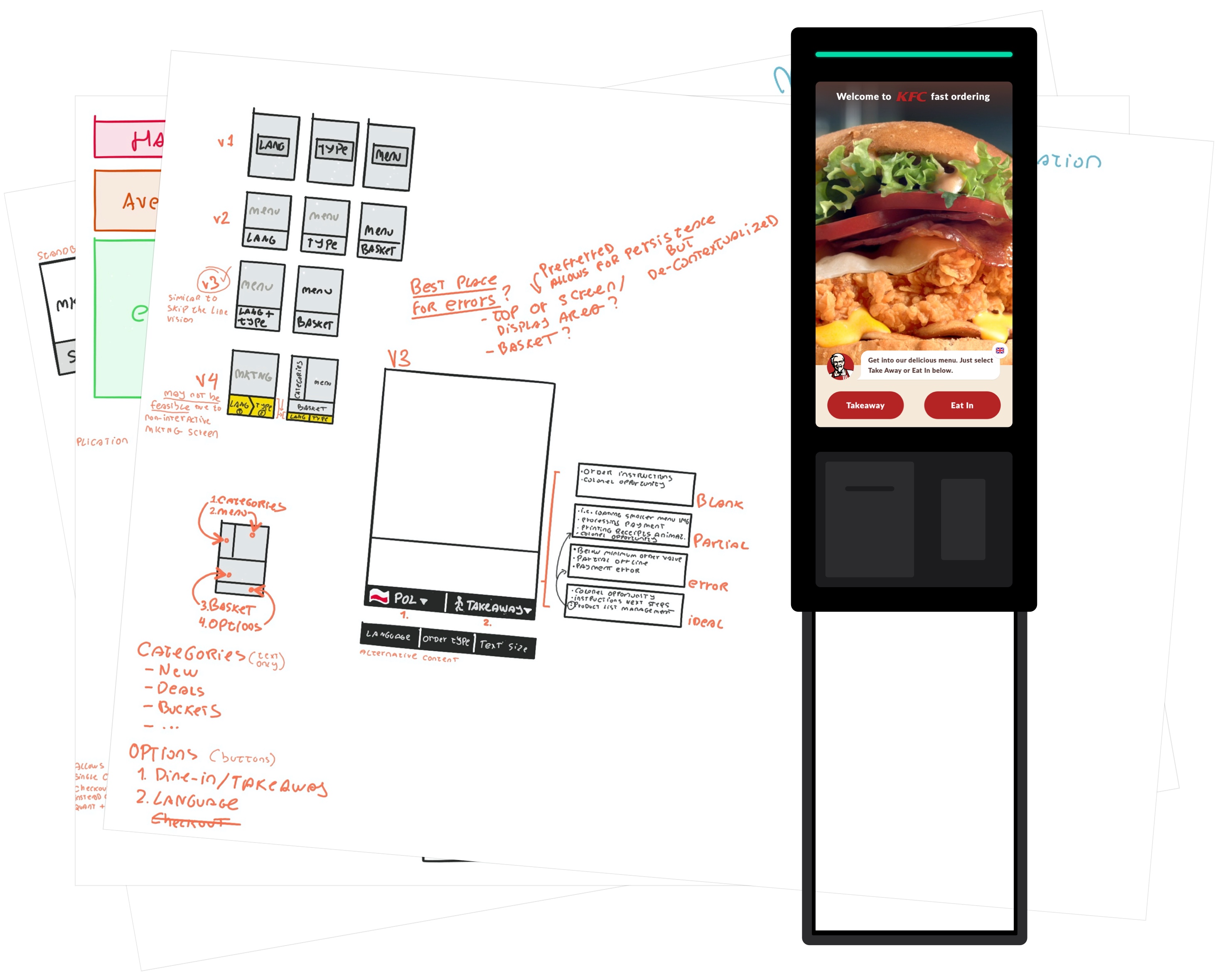
Workshop
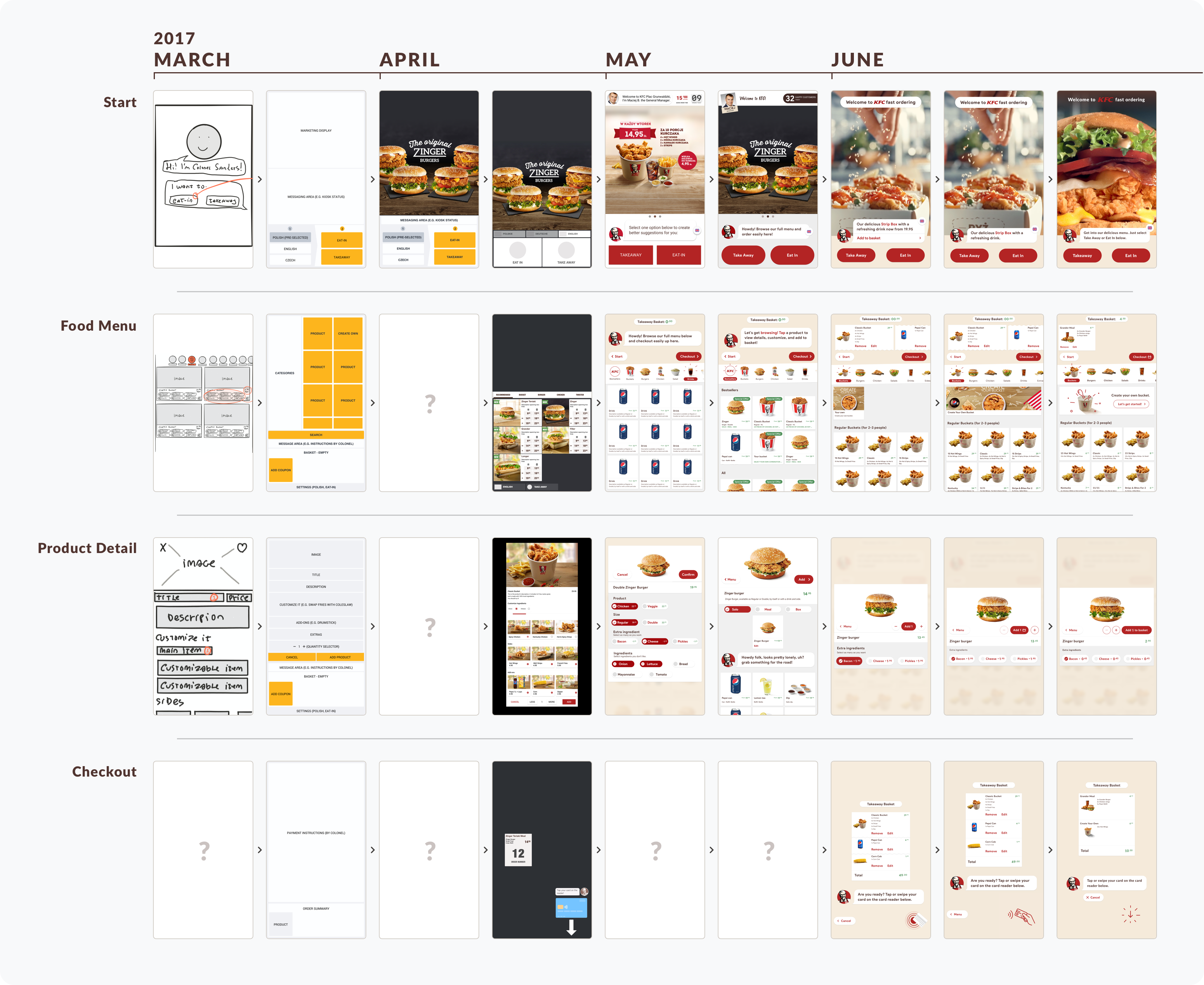
The very rough, very early wireframe prototype.
Before the workshop, taking the preliminary research into account, I created a barebones interactive prototype for an ordering user journey. This was done purely to explore how short and long-term features would interplay and impact ergonomics, information architecture, and navigation.
In the workshop itself, a 1-Day Design Sprint, we went over preliminary research, internal insights like the impact to restaurant operations and in-store physical customer flow, and the initial prototype.
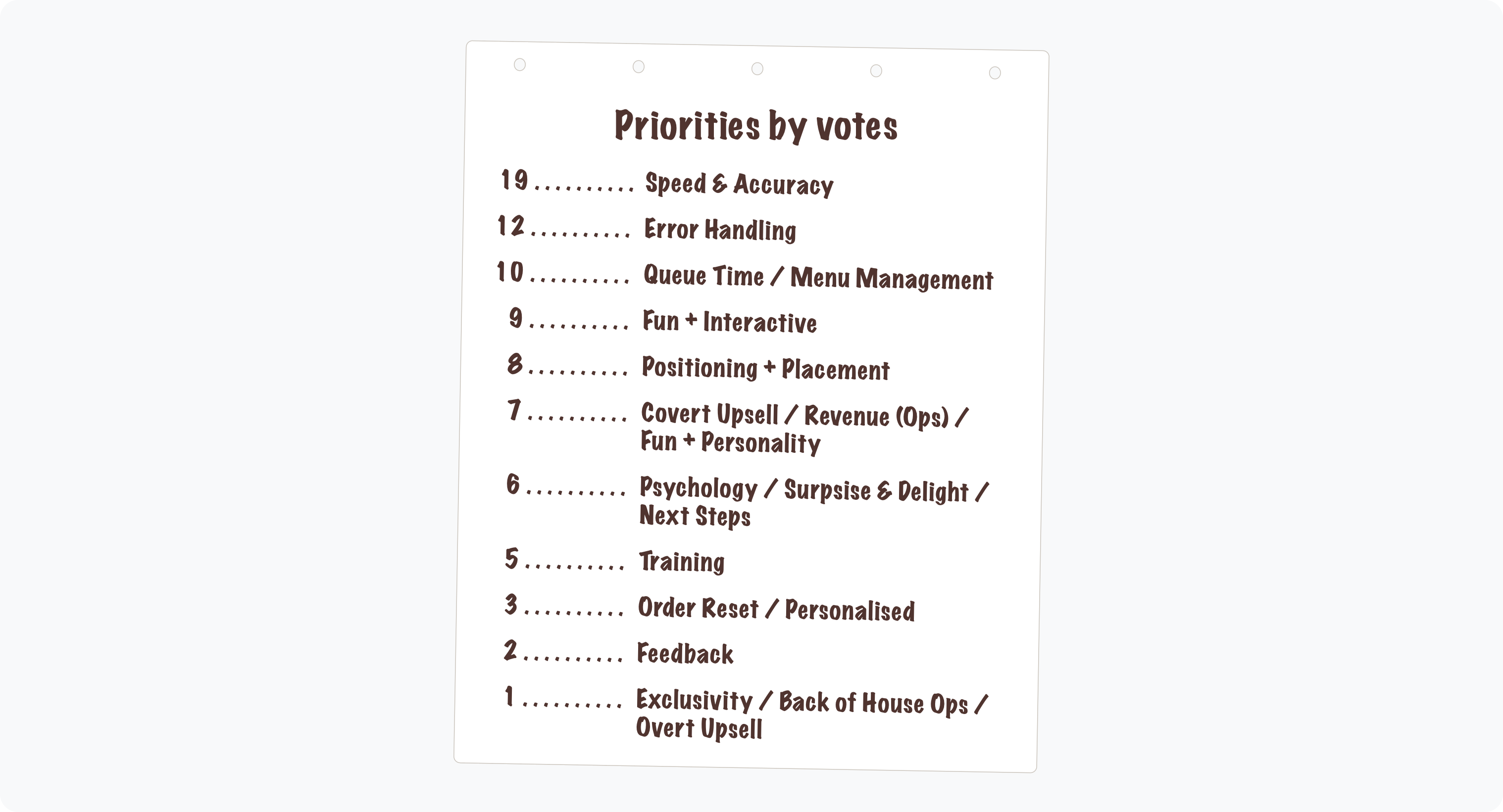
Priorities established through voting during the workshop
We ended the workshop with hardware platform specifications common to all vendors so we could design independently of the tender process, and an MVP scope plus principles to guide our work.
Some of these principles were:
- Speed & Accuracy: allow for quick ordering without compromising on quality;
- Error Handling: ensure staff is aware and can easily resolve errors;
- Fun & Interactive: leverage the KFC Colonel in a useful way.
Production
Ideation
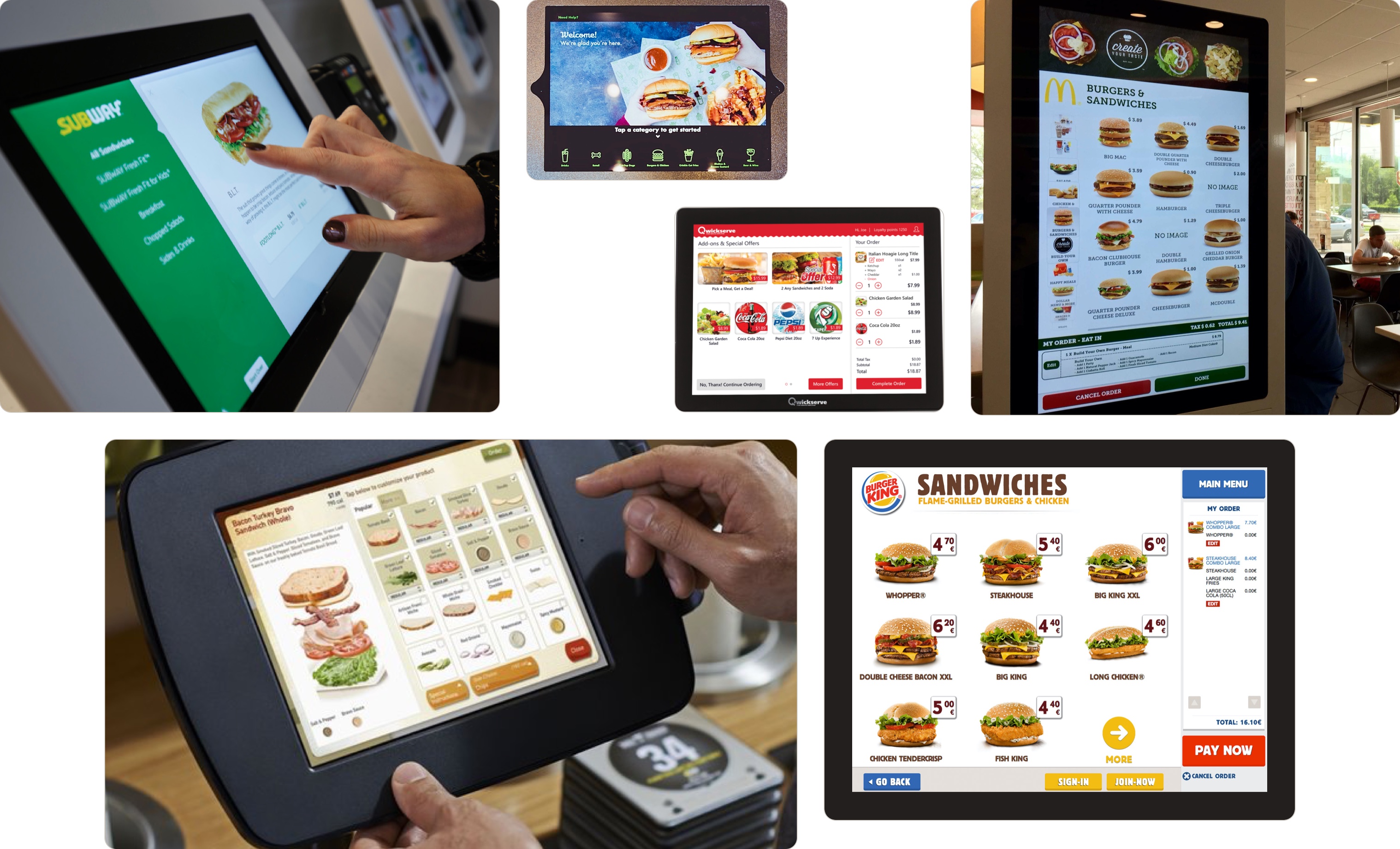
Kiosk software from various businesses, highlighting the diversity of user interfaces.
Designing for custom hardware is quite different from mass-produced, personal desktop and mobile platforms.
Software for custom hardware is, by definition, custom. With its own interaction and navigation patterns. Hardware peripherals, even if familiar in function as a card reader or receipt printer, are likely to be unique in physical appearance and location. Production quality is never as refined as something produced by Apple or Samsung, manifesting itself in poor touch sensitivity, and long hardware production lead times.
First, when a high percentage of users are new, how do we make a custom hardware platform feel familiar? There are no Human Interface Guidelines for custom hardware, so what do we use?
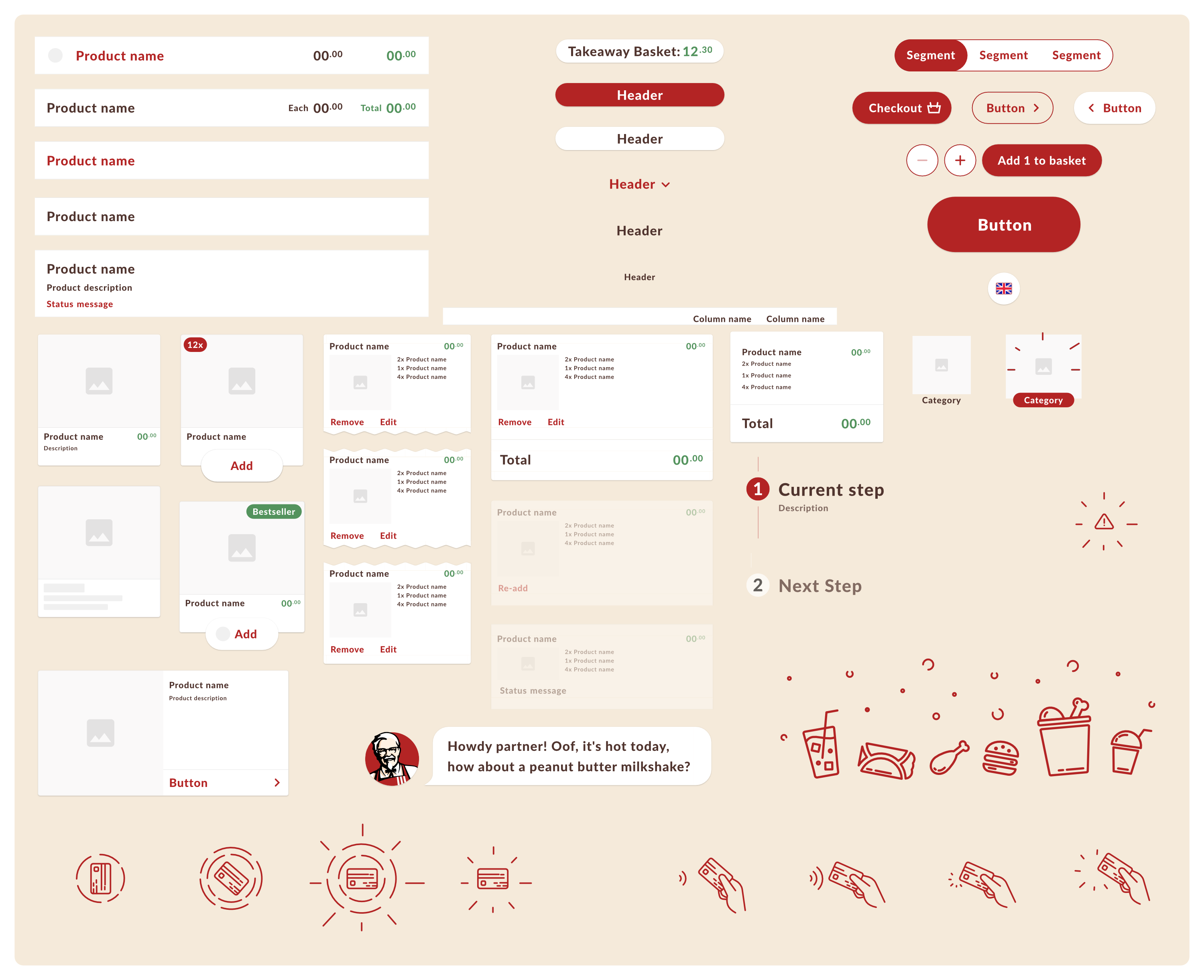
A sample of components used in the Kiosk, a blend of Material Design and iOS
To try and reduce the number of elements new to the user, I took into account the majority of Android users in the target markets, the work already done on the mobile app, device specific characteristics like the large 32-inch touch screen, and printer location.
Because we knew the majority of customers are Android users, and likely to be familiar with the app, the visual language borrowed heavily on Material Design: Card components are used to present products, Floating Action Button menus for changing language, and Material icons used in the app are also present here.
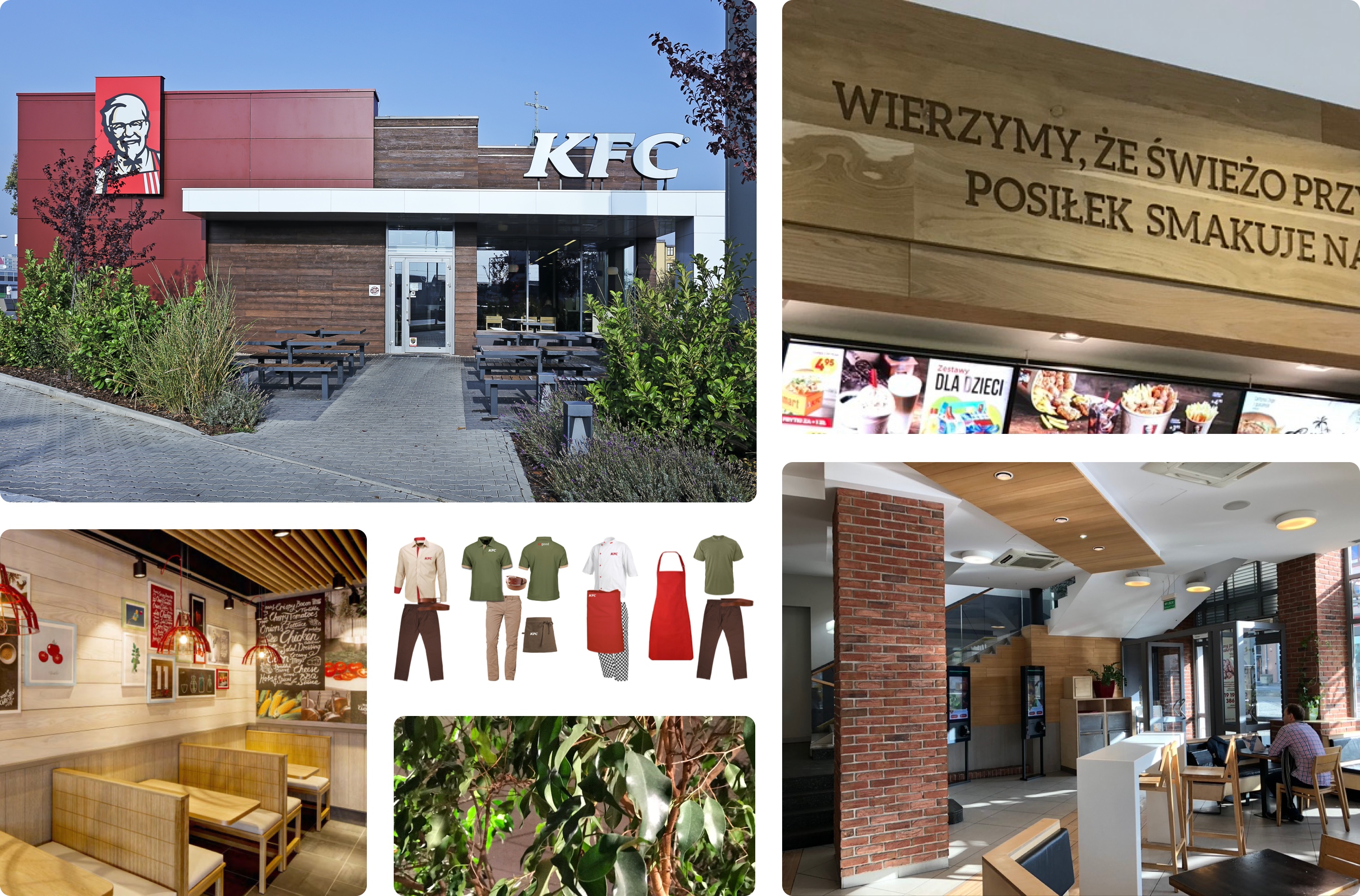
KFC Poland’s visual identity as expressed in restaurants and uniforms.
The visual identity of KFC in Poland doesn’t portray the brand as a global franchise. Instead of low-cost furniture and functional restaurants, the brand uses warm colours, wood and brick materials, and see-through kitchens where you can see the cooking process and ingredients.
I wanted the Kiosk to honour KFC’s visual identity, blending with restaurants and its staff. To achieve that I honoured the existing colour palette, added high-quality illustrations, animations, and KFC’s Colonel Sanders.
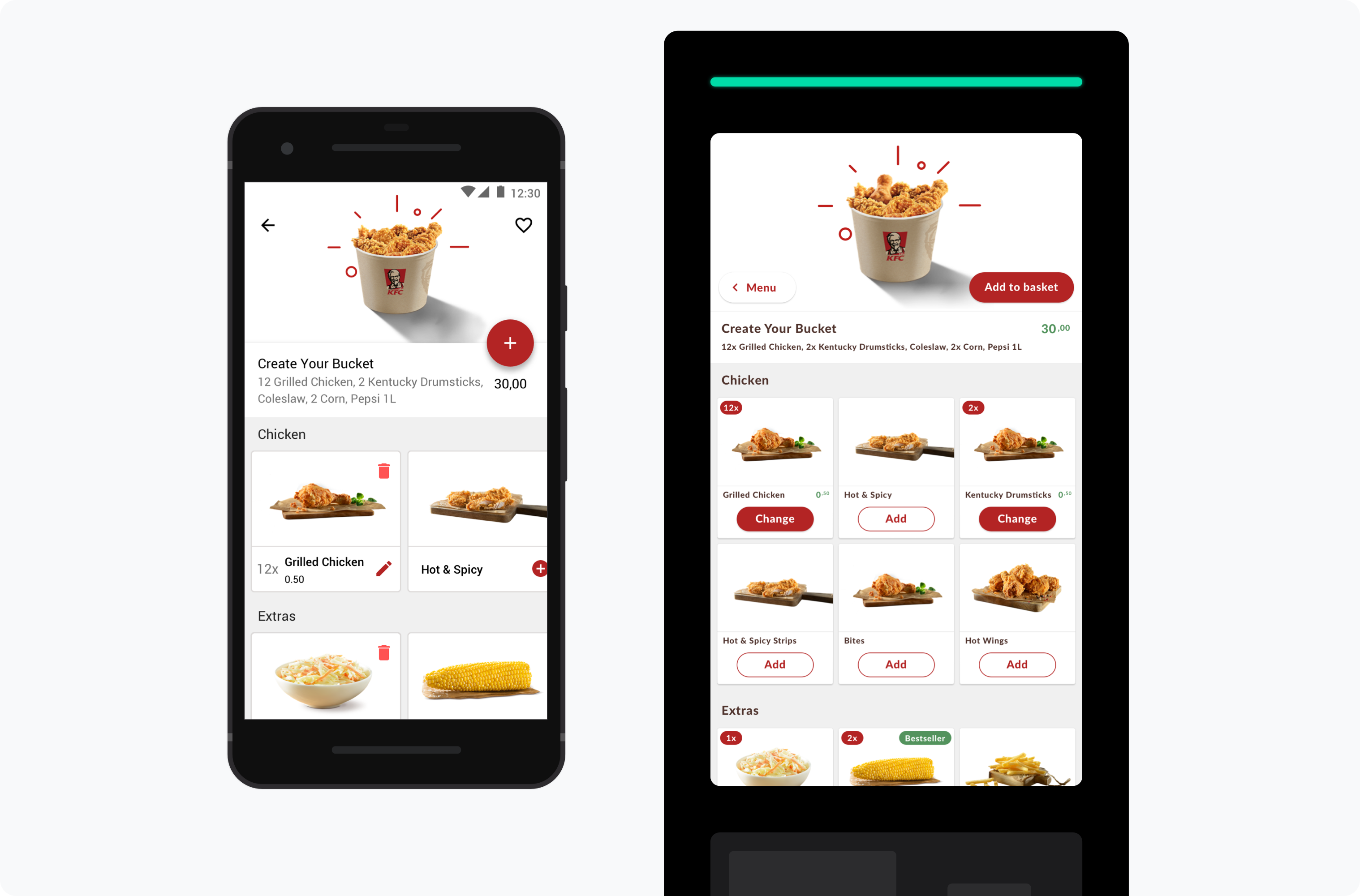
Consistency between Create Your Bucket on mobile and Kiosk.
Create Your Bucket is a key KFC product. To ensure familiarity and replicate the success we had in the mobile app, the presentation of this product was made consistent with the app, including animations, product selection and unit pricing display.
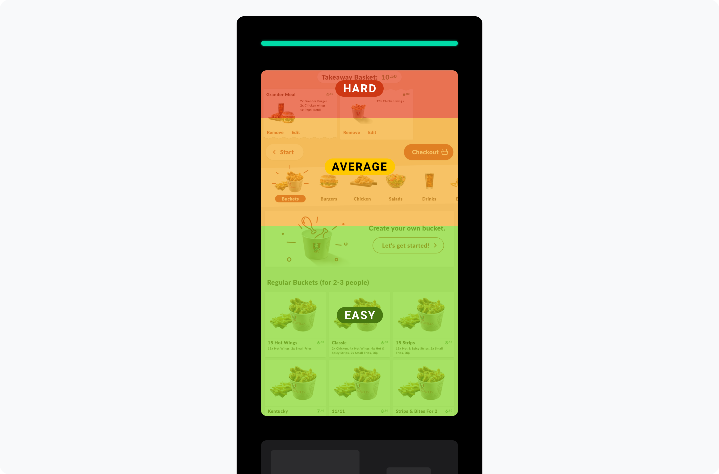
Reach effort for different areas of the Kiosk screen.
The 32-inch touch screen posed an interesting challenge because of it low resolution, despite its large physical size, and distance from the floor. To ensure the interface was comfortable to use, the screen was split into:
- Top: dedicated to information (messages, basket contents), and infrequent actions (checkout, restart) and;
- Bottom: easier to reach, and used for browsing and more frequent actions (product selection, add to basket).
Hand travel distance and deceleration were taken into account when I set the tap target to a large, and very easy to hit 104pt minimum size.
A known usability issue in Material Design (and icons in general) is the preference for icon-only buttons without a text label. I addressed this by favouring labels instead.
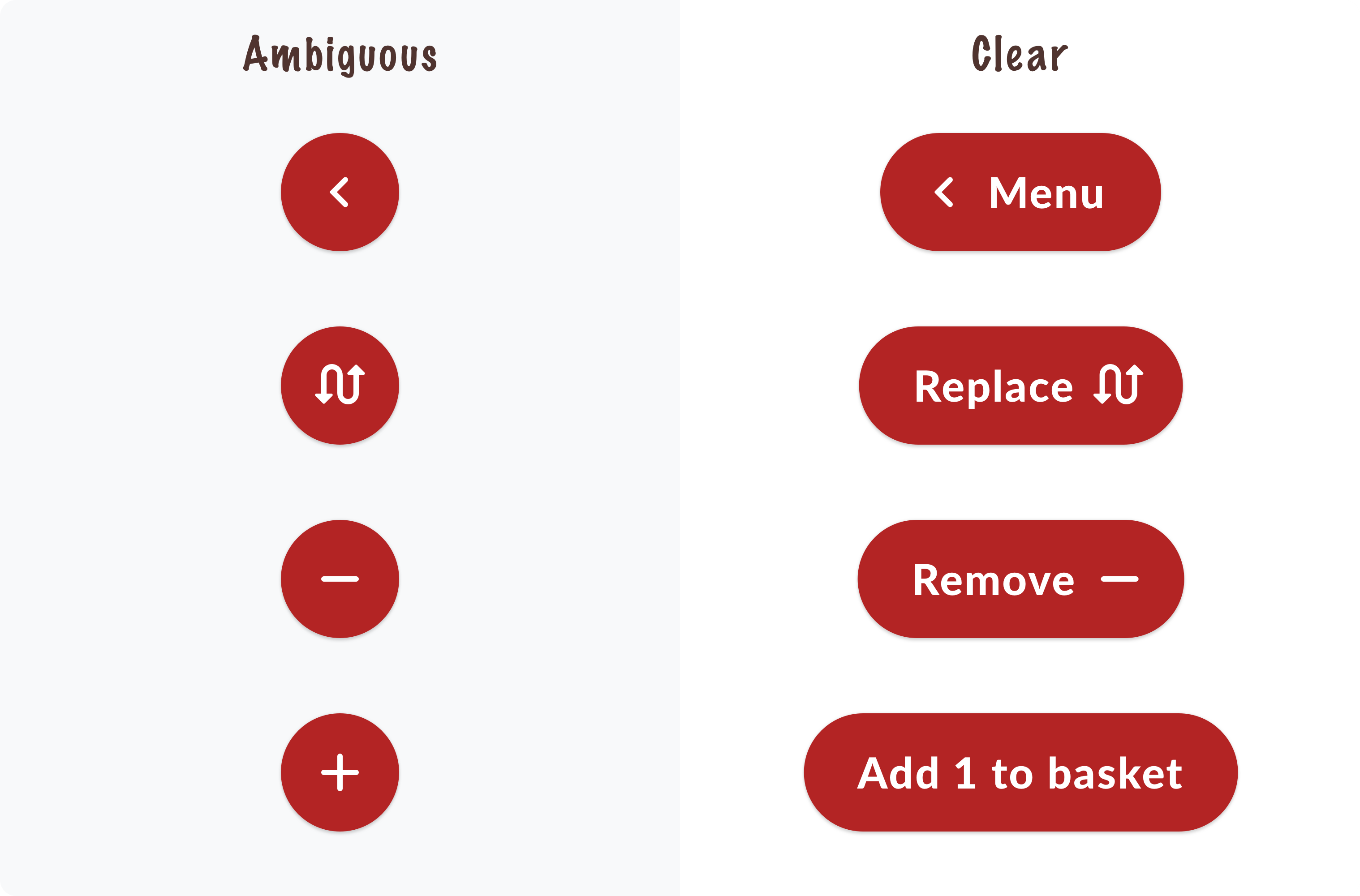
Left: Icon-only buttons; Right: Buttons contain labels, in addition to icons, to increase clarity.
Kiosks are often associated with a bad user experience. To try and soften this perception, I leveraged the Aesthetic-Usability Effect1 by increasing the radius on UI elements such as buttons (rounded shapes are perceived to be friendlier, more pleasing to the eye2).
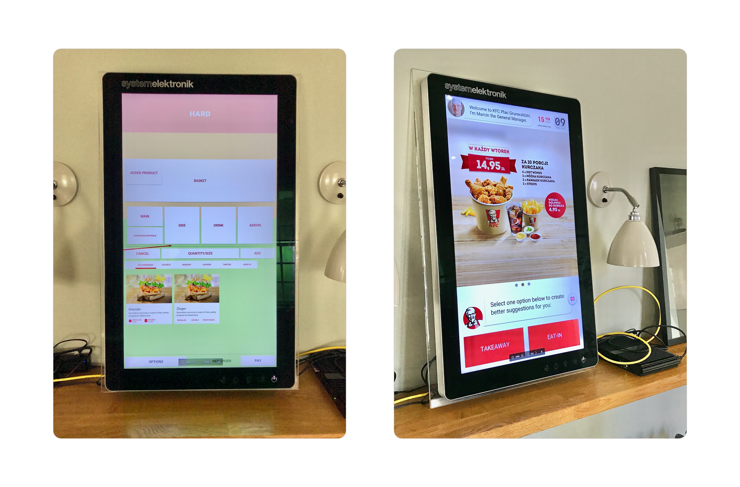
Two early versions running on prototype hardware.
Second, the Kiosk application will be running on low-powered Linux PCs, inside a Chromium web browser, interacted with via a custom low-res touch screen. Can we rely on gestures? How is text readability impacted? Can we use animations? Does printing happen immediately?
To answer these questions I worked closely with the remote developers who first got access to the kiosk prototype kits. Unfortunately, our lab kits were higher powered than the production hardware3 – more on this in the Iteration section.
It turned out that animations and gestures performed poorly on these machines, requiring extra work to prevent drag gestures to be recognised as taps, and lowering resource usage to create capacity for animations and a responsive interface.
Before I had access to prototype or final hardware, I sanity checked and validated my work with users on a 12.9-inch iPad Pro – emulating a touch interface and portrait orientation, propped on a desk of about the same height as the Kiosk screen.
The prototype hardware seen above allowed me to adjust the typographic scale to ensure readability on a screen that despite its 32-inch size, had a lower pixel density than an 1995 IBM Thinkpad.
This phase wouldn’t be complete without addressing the principles we agreed upon during the workshop:
Speed & Accuracy
Speed without compromising quality.
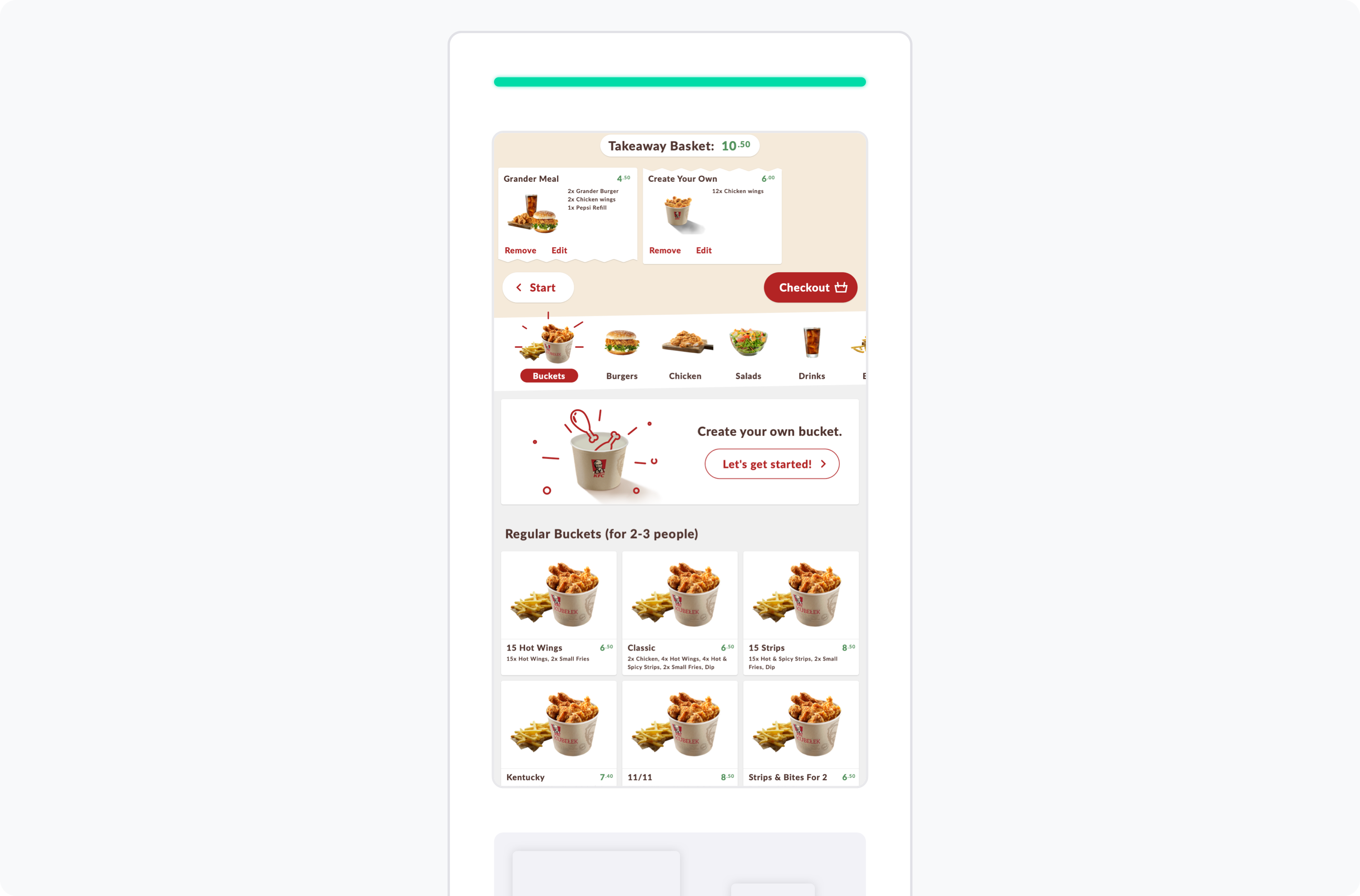
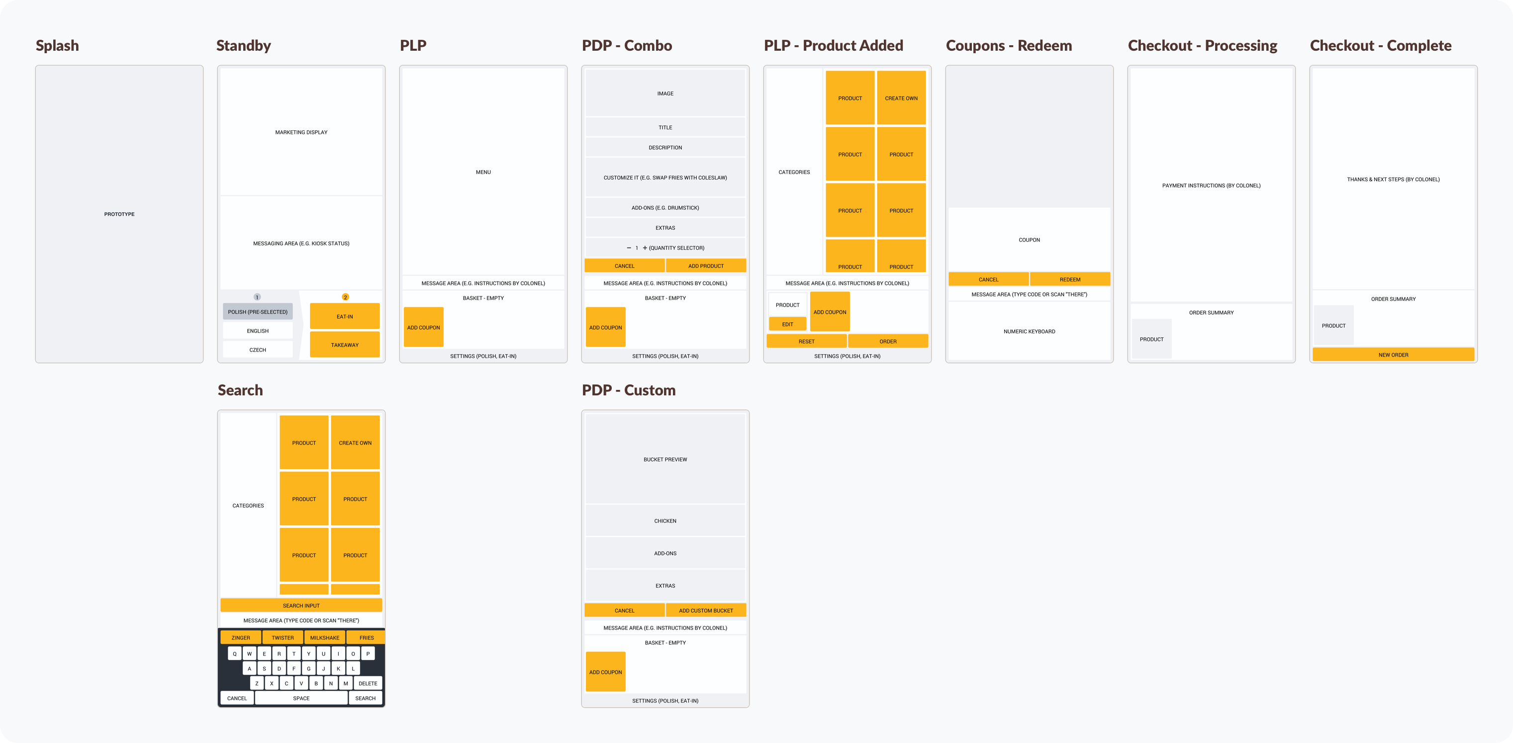
The main menu, with two items in the basket.
Faster browsing: to avoid queues and speed up ordering at the Kiosk, I took user mental models, business priorities, and Kiosk-specific behaviours into account. The number of top-level categories were reduced and made to match user’s mental models. This level was made permanently visible to increase their visibility and the effort to navigate to any one of them. A second category level was added and used to group products on a scrolling list. This is better because each group contains on average only 6 products, which can be easily scrolled through (scrolling can be done on a very large, easily reachable area). Both levels were sorted by popularity at Kiosks, reducing effort to reach the desired product.
Product cards with old and new imagery. Instead of photographing 300+ products our initial phase needed only minor editing of lighting, proximity, and decoration (adding straw, ice).
Clearer product imagery: Browsing the menu requires processing many visually similar product images. Up to this point, product images contained distracting background patterns and other artefacts, by researching studios on Human perception, I proposed and worked with KFC to simplify these. On a first stage, we removed product backgrounds, reducing the amount of information in each image. Subsequent iterations would take research into what makes product imagery appetising, changing aspects such as lighting, proximity, and perspective.
Error Handling
Quickly identify and resolve errors.
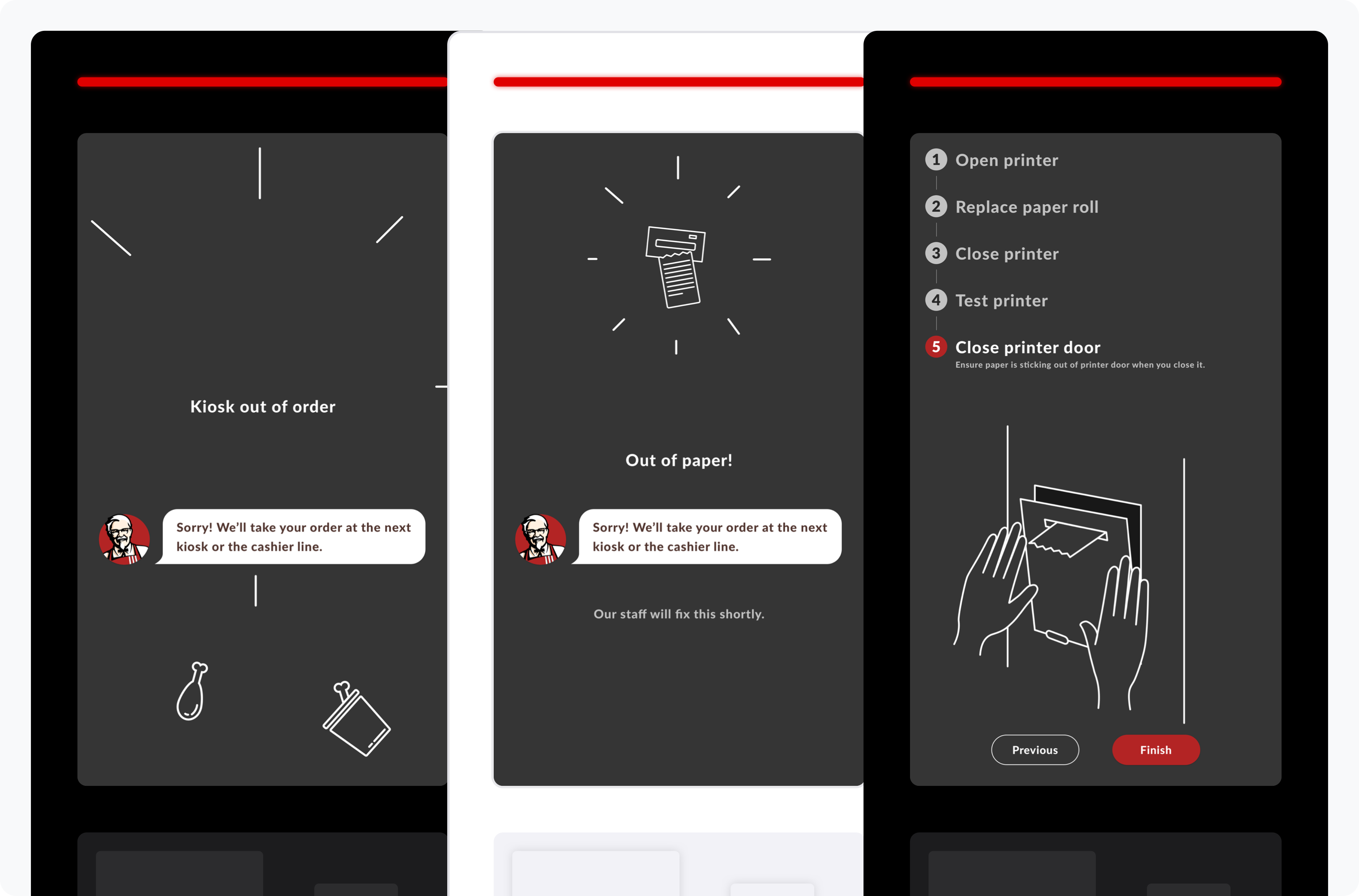
Maintenance screens were designed to contrast with normal operation screens, and reduce reliance on staff training by presenting step-by-step interactive instructions.
Maintenance screens: A choice was made to have Kiosks require paper receipts for fiscal compliance. So when paper runs out and receipt printers stop, so does revenue. To minimise downtime, restaurant staff is informed that paper needs to be replaced through a status light in the restaurant back of house, and on the Kiosk hardware itself. To lessen the reliance on staff training, I created maintenance screens to be displayed when Kiosks go offline. These screens were made to be visually distinct at a distance from normal operation screens (dark instead of light), and contain step-by-step illustrated instructions for replacing printer paper and bring the Kiosk back online.
Personality
Create a distinct, memorable experience.
The Colonel conveys various messages in the Kiosk.
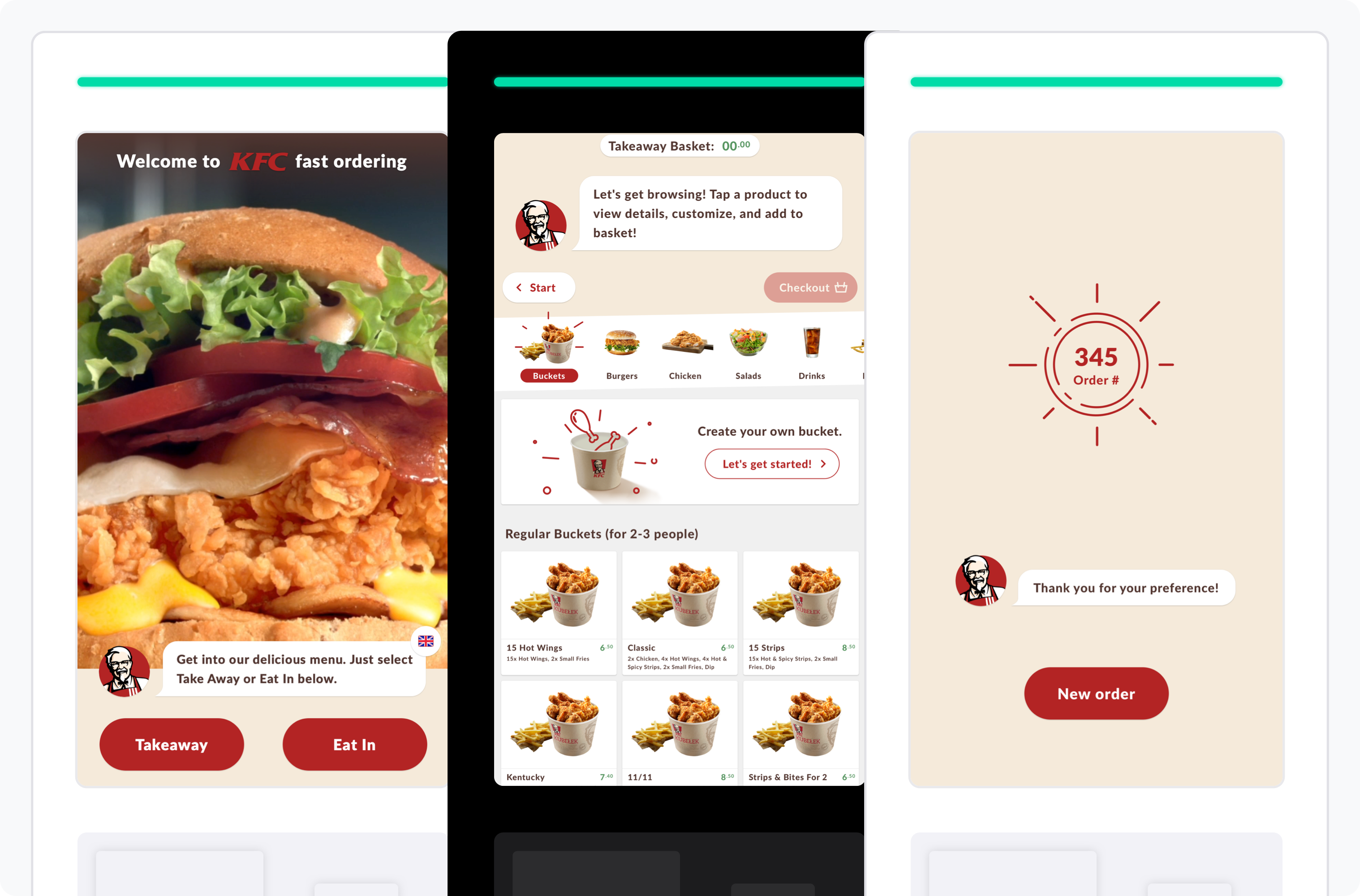
KFC Branding: continuing the work I did on the mobile app, the Kiosk communicates with the customer through Colonel Sanders. This is done to make the product friendlier and identifiable. The colonel welcomes the user to the Kiosk in the idle screen, guides the user about what to do on the main menu, performs product up-selling, and guides the user through checkout, without being gimmicky or obstructive.
Hardware integration: It wasn’t until the final production hardware prototype, that we realised printing would take longer than expected. To prevent a 5 second gap that made the Kiosk appear to freeze, we animated the transition of customer order into a receipt, which comes out from the bottom of the screen, through the printer located below.
Validation
Validation brings you closer to the truth.
In addition to the preliminary research at the start of the project, I conducted qualitative and quantitative research at various points, targeting: ergonomics, usability, satisfaction, and user behaviour.
Amongst other findings, I learned how my interface performed ergonomically, the right text metrics for a large low-density screen, how in this context users expect bottom-placed action buttons matching a top-down reading order, menu browsing patterns, how kiosk placement increased awareness and acquisition.
When trying to find out why bounce rates were higher in the morning, speaking to customers revealed it was purely because the Kiosk didn’t include breakfast items.
Analytics also included scroll events, to address stakeholder questions around usability, and act as a signal for menu hierarchy efficiency: less scrolling = matching content with user intent.
Implementation
Documentation in written form, mockups, low and hi-fidelity prototypes, and demo videos were used to provide guidance to developers during implementation.
The hardest challenge was designing for a platform and context I had no access to for the most of the ideation and implementation phase. The kiosk hardware needed a final spec, had to be produced, restaurants had to be setup, staff needed training, and finance had to take the new channel into account.
During the time I only had hardware specs to work from, I improvised by using an iPad Pro 12-inch for user sessions and my own needs.
Iteration
Some of the iterations this project went through.
Menu hierarchy: analytics showed an opportunity to reduce the amount of navigation required to order common product pairings. We iterated by sorting categories by popularity and improving product suggestions in up-sell screens.
Coupons: Sometimes your learnings simply help you prioritise existing ideas. During the staged rollout we confirmed once more that Coupons needed to be a priority for the next release, as their unavailability was preventing user acquisition.
Information density: I initially set out to create an extremely efficient interface to reduce navigation to a minimum. During prototyping I realised this was hard to achieve if the interface was to be extremely clear for users with no time to spare. As a result, I dialled down on information density, increasing the number of steps required to order a product, but ensuring those steps were predictable and could be performed quickly.
Interface hierarchy: One of the last learnings was about button placement. Initially I placed actions below the product image, similarly to the KFC mobile app, I then made a plan to move them to the bottom of modal windows after discovering users expected to find them at the bottom of the modal, after having reviewed product options and extras.
Results
Dark, Light, and Compact Kiosk hardware (top-right)
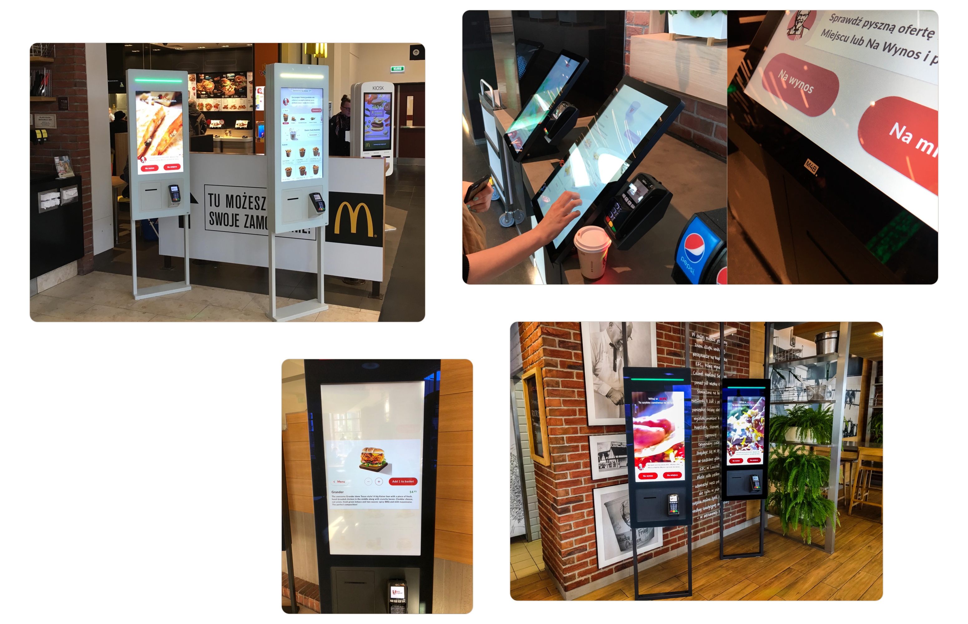
The Kiosk is live in 300 restaurants across 3 countries4, with some iterations on the outer casing: Light, Compact. It has also made its way to stock images due to its widespread deployment.
Featured in Fast Company’s 2018 Innovation by Design, and received good ratings on Awwwards.
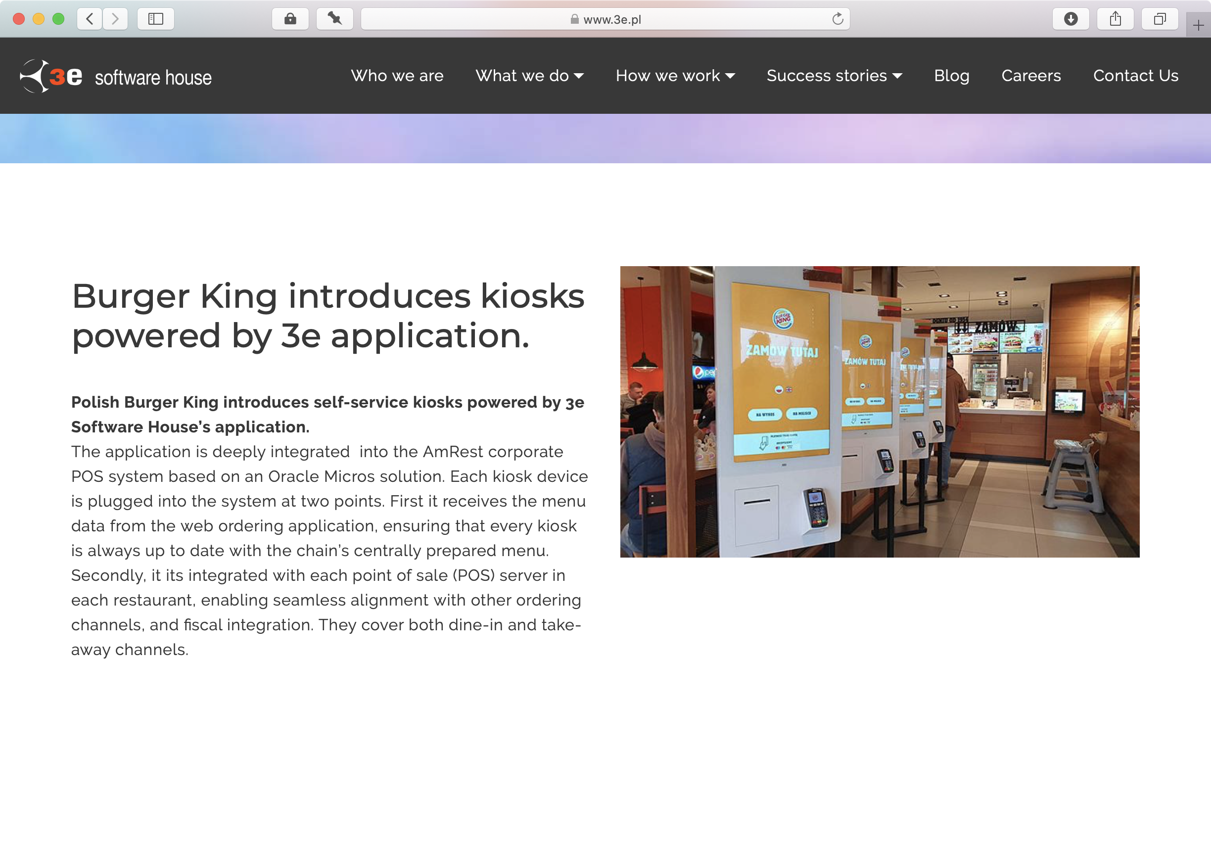
And finally, it has been used as a template for Burger King5, and will eventually be rolled out to Pizza Hut.
-
Objects that are aesthetically pleasing, are perceived to be easier to use, and errors more likely to be overlooked., The Aesthetic-Usability Effect ↩
-
“We prefer curves because they signal lack of threat.”, Why Our Brains Love Curvy Architecture ↩
-
The hardware your software runs on, is as important as the software itself. Using custom hardware is a decision I strongly disagreed with, and despite voicing my concerns, making cost and value projections, demoing how mass-produced hardware performed better, complied with all the requirements, and was had precedents in McDonalds and Panera, this was a decision I could not change. As a result, the experience was made poorer due to poor resolution, poor performance, buggy gesture recognition frustrating users, an increase in restaurant staff workload and costs due to the printing and replacing of paper receipts (Kiosks did not work when out of paper, also lowering their effectiveness.) Finally, the cost of custom hardware, device management and repair services were 13 times higher than mass-produced hardware. Even with higher replacement rates, mass-produced hardware, like an expensive iPad Pro, would still result in better ROI because of the superior user experience it enables, and reduced ownership and provisioning costs (instant off-the-shelf provisioning, auto configuration through MDM, hot-swap with defective model). ↩
-
The Burger King version has no Colonel, but two large round order type buttons, prominent language selector, payment information as per unreleased KFC mockups. ↩

