The Mental Notes card deck is a really useful design tool; it contains psychological principles you can use responsibly when designing experiences.
The first problem is that it’s no longer on sale — perhaps due to the costs of producing and shipping a really nice physical card deck. The second one is that physical limitations hinder the sharing of the actual cards and information in it contained.
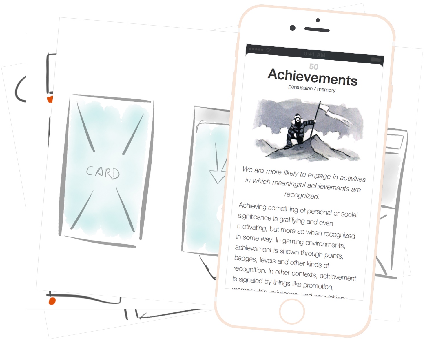
As a side project, I’ve been designing a simple iOS app to solve these problems. The screen shot above is the current version and it solves these two simple problems:
- Availability
- Shareability
With it, all of the cards are available on your phone — regardless of your internet connectivity; you can instantly search for cards; create new decks and share them as well as the cards themselves via AirDrop or a public URL.
This is an ongoing side project — currently pending an agreement with the author Stephen Anderson; but I’m hoping it’ll be out pretty soon.

On the left, an initial layout with the standard navigation bar and search bar beneath on top of a table view. On the right, a menu that’s revealed when swiping down the card — like the one in Facebook Paper.
I started with the option on the left but quickly switched to the solution on the right for 3 main reasons:
- The Card Title didn’t have enough room
- The Card was broken into Title in Navigation Bar and Content
- It just didn’t play nice with a paginated view where the focus is the Card
This menu is always accessible by swiping down when reaching the top of the card, which is easily identifiable by the large title and illustration. It also scales well and provides one-tap access to All Decks and can be further expanded. The tap areas are a lot more comfortable than the typical ~44 pts, and it also looks refreshing.
This menu has no direct affordance, and despite being fairly discoverable, I’ll prefer to have the card slightly bounce down a bit on certain occasions, revealing part of the menu behind it, and hinting at the possible interaction.
Even as a side project, I previewed it on a real device, not just laptop/desktop screen. It was also tested for readability in direct sunlight and color blindness.

