
You may have had to explain the value or usage of an app feature.
A popular solution is the paginated walkthrough: a few screens shown on first launch, each with a brief explanation of a main feature, like the one below.
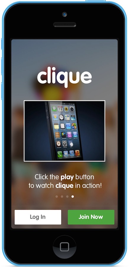
Walkthroughs exist for a good reason. A first run is the one moment a team knows it has the user's attention, and a walkthrough is a cheap, contained way to spend it. The assumption underneath is that people will read these screens and retain what they say. That assumption is where it goes wrong.
The Problem
{% include blockquote_author.html src="/media/images/posts/luke_wroblewski.jpg" quote="“Most people (sometimes over 90%) skip over intro tours as quickly as possible and those that don’t rarely remember what they were supposed to learn.”" person_name="Luke W." person_role="Product Director at Google" %}
Attention, repetition, duration, and recall all shape how well people learn. If most people skip these screens, we've lost their attention before we've taught anything.
Untimely
When someone launches an app they have something they want to achieve, and they're usually short on time and on patience for delays.
People skip walkthroughs because they didn't ask for them. Unasked-for information is unexpected, and unexpected information is easy to dismiss. Without the motivation to read it, learning suffers.
Remember what your users have already done by the time they see your first screen: found the app, installed it, logged in. They open it expecting to use a feature straight away.
Single Exposure
A walkthrough is shown once. One brief exposure to information nobody requested is a recipe for poor recall.
The Spacing Effect and the Testing Effect both point the same way: people retain information better when they meet it more than once, and when they practise rather than read.
Focus and Platform Awareness
In the same way that Hamburger Menus make it easy to add one more navigation item, walkthroughs make it easy to add one more illustration or animation. These can look good on their own and still not help the person using the app.
Maybe there's a better way.
Other solutions?
What can we use instead? Something that shows up more than once, and stays out of the way until it's relevant.
Break that walkthrough apart

There's no need to bin your walkthrough. Split it into smaller pieces and show each one at the moment it's needed, more than once, and favour practice over theory.
For walkthroughs that need input, such as personalisation screens, move the input to the point where it's used, for example when presenting customised playlists. For other forms, source what you can from sensors like location, enable autocomplete, and offer federated log in instead of email.
Just-In-Time Education
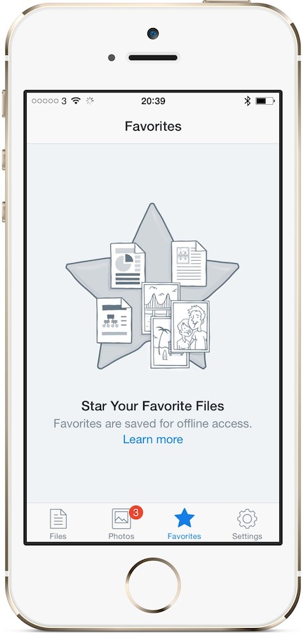
In the example above, Dropbox explains the value of favouriting files, with a ‘Learn more’ button for anyone who wants to go further.
The information is timely because the user chose to open this screen. That makes it relevant as well.
By putting the explanation in the empty favourites screen, Dropbox tells anyone who hasn't favourited anything yet why and how to do it, every time they visit. Once the user favourites an item the screen fills, and the lesson steps aside on its own. The user has shown they understand the feature, so there's nothing left to teach.
The placeholder could go one step further and show how to favourite a file:
Apple has done something similar in the macOS Trackpad preferences, with a short video beside each gesture:
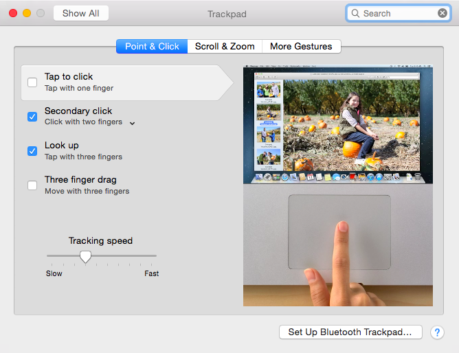
Just-in-Time Education also works outside placeholder screens, alongside existing content.
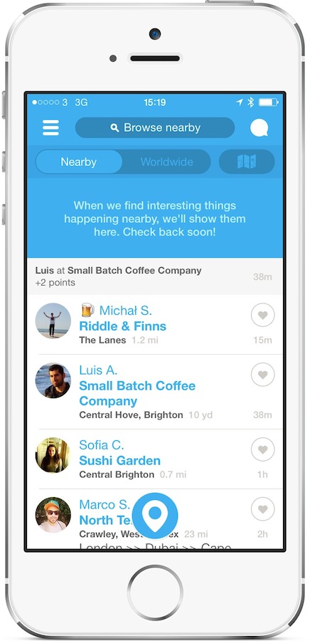
Above is the old Foursquare app. Below is an app I worked on at the time:
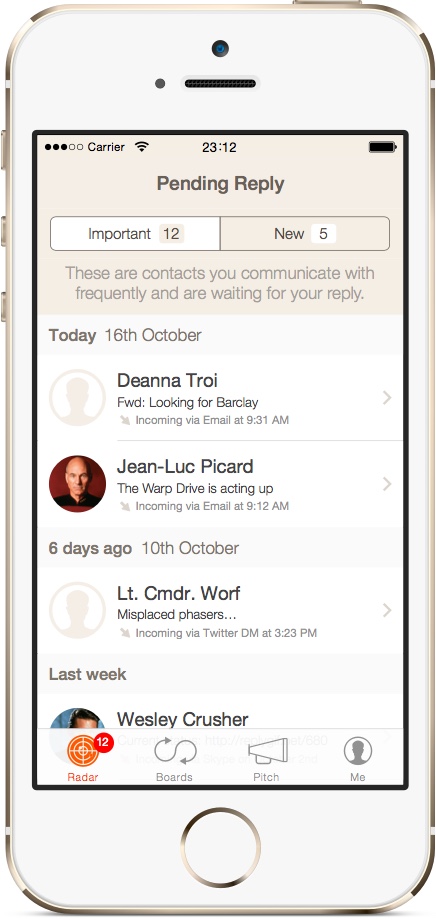
The information sits in context without getting in the way. The same spot can carry progress feedback:
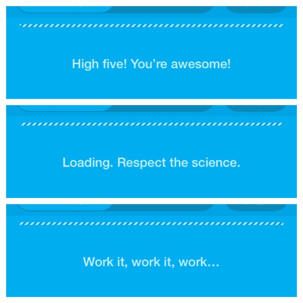
Foursquare's humour is a lovely touch. It turns copy that could have been dull into a bit of personality.
Wrap Up
Walkthroughs struggle because they arrive before the user has asked for them, and only get one shot at sticking. Just-in-Time Education gives the same information a better chance, because it arrives when the user is already looking for it.
If you have a walkthrough today, here's a place to start. Take its single most important screen and move that one explanation into the empty state of the feature it describes. Watch whether people use the feature more. Then do the next one.
Related external article: Unnecessary Explanations
I'm also available to apply these principles to your app, just get in touch.